Monday, April 16, 2012

Update on My Final Project for New Media Theory and Practice


For my project this semester in New Media Theory and Practice, I‘m going build a Slash Page for my digital portfolio.  This site will serve as a virtual introduction to my scholarship, my pedagogy and me.  It will both visually and verbally convey my interests.  This site will take the place of my current professional site, which I don’t think truly captures who I am or my research effectively. 

This splash page will be built using Photoshop and XHTML/CSS.  I will use Photoshop to design/edit the images of each of the components on the page.  Then I will use XHTML and CSS to put them together in a web space, animate them and make them into links into sub-pages.  In addition to this overall framework, I have one portion of this splash page that I want to make interactive.  To make this interactive component, I originally was going to use a simple Flash program, but after talking to Shelley Rodrigo, I agreed to take the challenge and develop it in HTML5.  I am not a fan of Flash because of its incompatibility with iOS, but I felt more comfortable learning a simple Flash program because I feel like I have a basic sense of how Flash works.  However, Shelley encouraged me to get out of my comfort zone and invest in the technology that is up-and-coming, rather than the one that may be seeing its endpoint coming soon.

The first thing I did to work through this project was to spend some time sketching and talking through what I wanted it to look like.  I have had a murky mental picture of this thing, but I needed to talk through what it would really look like.  To do that I spent some time with some giant paper, colored pencils and my husband, just sketching and scrapping ideas.  From there I was able to get a picture of the components I need for the project.  Next stop—building!

Here are the components I’m thinking through:

The Slash Page:
· Side of a building with a street light next to it.  
· Building covered with various bits of graffiti and posters
· Center of the building, a door covered in stickers
· On the ground are a series of spray bottles, some lying on their side, some upright
· The bits on the wall include:
o Graffiti Lettering:  TEACH.
o A series of the same poster—done 1990s punk rock poster style that say something about Research on them  (Above them a sign “Post No Bills”)
o A wheat paste image of a Twitter Bird
o Some play on a poster that has a picture of me and “tear off” contact slips.
o My name is stenciled somewhere on the wall.
The Action:
· Hovering over each item makes it animate and enlarge.  The viewer can then click on it to enter the page:
o Door – “Enters” into a bio page with links to the other parts of the page (for viewers who want an hierarchical, linear experience)
o Street light –to my blog “Cicero’s Lightbulb”
o Graffiti Lettering:  Leads to a page on my teaching
o Wheat paste – leads to a page with my Twitter feed
o Poster series –leads to a page on my research
o Wanted poster – leads to my CV, unless you click on the “tear off strips” which lead to Contact me.

The Big Challenge:
Clicking on the spray bottles will take the viewer to a new page where the same wall from the splash page is now blank.  Clicking on the wall will allow them to “tag” it.  This will be accomplished through HTML5...once I figure out how. 

Subpages:
Once the splash page is created, I’ll create the contents to have a seamless visual identity.  This will require making Twitter and Blogger themes using CSS that continue the display from the other pages of the website.  It will also require revising my current personal website material (and CV) to continue the street art them that the other parts of the page will have.  These content pages will likely not be completed by the end of the Individual Project in English 866, but I will continue working on developing them for the Digital Portfolio project for the Foreign Language requirement of my degree.  

On Multimodal Online Journals


Over the last few weeks in New Media Theory and Practice we’ve taken some time to review a variety of online journals that allow scholars to present their research through multi-modal avenues or present research that explores multimodal texts.  We’ve examined Technoculture, C&C OnlineCCC Online, Kairos, Enculturation, and Flow.  Each of these journals has a slightly different scope, purpose and audience, but they all have this common thread in the way they value multimodality. 

As I looked at these, I was particularly interested in observing interface decisions and design choices.  While the field has had decades to establish good design choices for print journals, it’s clear to me that we’re still developing this genre for the digital world. 

One interesting observation I had while I was looking at each of these was the dominance of blue in the design.  With the exception of Technoculture, all of these journals use blue as a dominant design color (though Enculturation’s might be said to be a bit more purple than blue).  Having noticed this pattern I started to wonder why this coincidence occurred.  This led me to an article on a site called Web Design Ledger called “55 Beautifully Blue Web Designs toInspire You.”

The author of that post, Gisele Muller actually encourages design using the color blue because of the associations that go with it.  While the connotation of sky and sea that Muller references is one reason blue might be a good design choice, another reason might be accessibility. 

In an interview with Chandoo.org, Garr Reynolds, author of Presentation Zen talks about color choice and says, “You need to realize that lot of people are color blind, so it is safer to use shades of blue or gray than using lot of colors. There are really no hard and fast rules for colors” (Read the whole interview).

Thus, blue might be a go-to web design color because it’s more interesting than gray while retaining accessibility to those who are color blind.  Interesting stuff.

Screen Shot of Flow
Screen Shot of Flow
As I considered the design of these sites, I think I was most drawn to the ones that were simplistic and straight forward in design.  Flow, whose content I find most interesting because they welcome articles that are somewhere between journalistic and academic, was the least appealing to me as a navigator, though the page as a whole is not unattractive.  It was hard for me to prioritize my viewing experience because there was so much to choose from.  

Instead, I preferred Technoculture and Enculturation's interfaces.  
Screen Shot of Enculturation
Screen Shot of Technoculture
Screen Shot of Technoculture
I had a slight preference for the latter because all of its navigational options were on one side, rather than on both left and right of the main column of the page.  As I think about these preferences, however, I cannot help but to assume that I have these preferences as a result of my book-biased cognition.  I think I am used to and comfortable with the linear consumption of knowledge.  Perhaps it is not that Flow has a problematic interface, but rather my mind is uncomfortable with the prospect of having to learn as a means to gain access to a document.  I wonder if the next generation will feel more comfortable in such interfaces and if my comfort will grow as these things become more commonplace?

Monday, April 9, 2012

Does Remixing Like Tarantino Keeps Us Human?

Throughout this semester in New Media Theory and Practice, I’ve been looking for definitions of media and new media to latch onto. Honestly, I’ve always found “new media” in particular to be a slippery term to hang onto. I found in Flusser’s Does Writing Have a Future, however, a definition that I really am drawn to. He defines media broadly when he says that media are “bridges supported as much by the receiver's as by the sender's pylon” (Kindle Location 550). In this way media is given a broad definition that encompasses all types of communication. Media is the tool that facilitates the delivery of the pylon, whatever that might look like in a given context.

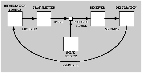
 This definition isn’t really revolutionary, but I appreciate the concreteness of it.  It gives me another picture of the classic sender - receiver model, which is pictured below, but one wherein the Transmitter, Signal, Noise and Receiver are all quantified as being the work of the media.
Sender - Receiver Model Diagram that shows Information flow from Source to destination
Source:  Wiki of Science

One thing that’s struck me as I’ve been working through this book is that I typically think of expressing content through visual means as a form of new media communication. However, one thing that Flusser’s book points out to us is that this kind of communication isn’t new to the digital age. He says, “As the alphabet originally advanced against pictograms, digital codes today advance against letters to overtake them” (Kindle Location 1628). This reminder helps me to think about how a lot of technological revolutions are really a matter of remixing older artifacts.

What’s important about this observation is the humanity that Flusser sees in thoughtful remixing. He says, “We fear that in the future, all messages, especially models of perception and experience, will be taken in uncritically, that the informatic revolution could turn people into receivers who remix messages uncritically, that is, into robots. (Kindle Location 935). Like with the text of How We Became PostHuman, Flusser keeps returning to the cybernetic fear that we face if we change the way we code and recode information. However, he indicates that one characteristic that ensures us our humanity is this notion of critical remixing. In many ways, I think our clever use of remixing is what, even more than the empathy from Do Androids Dream of Electirc Sheep, makes us unique from the beast and robots of our society. In fact, I think many of the great thinkers of the contemporary age stand out to me as genius because of the way the can use remixing.

For me, there’s no greater example of this than my personal favorite: Quentin Tarantino.

This video, part of Kirby Ferguson’s Everything is a Remix Series, shows the beauty and detail through which Tranatino remixes to create Kill Bill.


As I think about remixing, I’m not hopeful that the robots of today or the near future will be able to remix in this way.  But it does make me wonder:  what would machines need to accomplish this task? What is it that makes humans skilled remixers?


Reference:

Flusser, Vilem. Does Writing Have a FutureMinneapolis: University of Minnesota Press, 2011. Kindle Edition.

Monday, April 2, 2012

Writing Sucks the Life Out of Us


So I hate vampires.  It’s a thing.  No—really.  I don’t watch movies with vampires in them, not even if they sparkle.  Especially not when they sparkle.  Actually—I’ve only ever liked one vampire in this lifetime.  The Count.  Featured in his glory in the video below:


Actually, I suppose if you count Count Blah from Greg The Bunny, perhaps I like two vampires....Nevertheless..

So, I was quite surprised to find vampires show up in Flusser’s Does Writing Have a Future.  But they’re in there.  And…apparently…they are in this blog too.  Turns out, they’re everywhere.

Flusser says, “In their battle against the spoken language, characters of the alphabet (which are basically nothing but dead letters, invented to spin the magical promise of myth out into lines) suck the life of the language up into themselves:  letters are vampires" (Kindle Location 542). 

Letters—these trusted friends I’ve had my whole life.  Vampires?  Yikes.  Apparently the Count wasn’t the only Vampire featured on the average episode of Sesame Street.

As much as I hate vampires, I really dig this metaphor.  It creates this image of the alphabet drawing strength only from its ability to tap into the life of live language. It shows us that the alphabet that we so put our trust in is nothing without the life force of language that we breathe into it when we write.  I like it.

Vampire written upside-down with red on the tops of the M's to resemble bloody fangs
Image Source:  Awesomenator
What’s more, Flusser metaphor of vampiric letters also explains the taxing nature that the writer goes through when he or she takes to the task of writing.  He claims:

“The writer presses the letters, these dead marks, against the living body of the language so that they can suck life out, and lo and behold: these vampires take on an eventful life of their own under his fingers. No wonder he swoons, feeling his life energies have been spent” (Kindle Location 525). 

I think if we believe this metaphor to really capture the heart of what transpires when an author takes to writing then it helps to understand why writing can be such a painful process.  After all—those letters have to suck the life of language from some place.  That place, in the writer’s case, is from the writer his or herself. 

Reference:

Flusser, Vilem. Does Writing Have a FutureMinneapolis: University of Minnesota Press, 2011. Kindle Edition.